Design Tab - Toolbars
Overview
The various toolbars accessible from the design workspace are documented in this section. The toolbars are dockable and follow the Office interface style. The toolbars are accessible from the View...Toolbars menu option of the Report Designer or by right-clicking on the docking area at the top of the Report Designer.
The Report Tree
To access this tool window, select the View...Toolbars...Report Tree menu option from the Report Designer main menu. This tool window is dockable on the left and right sides of the Report Designer. The top pane contains a tree view of the SubReport structure that comprises the report layout. The elements in each band are displayed in z-order. The bottom pane of the Report Tree contains the Object Inspector, which can be used to view and modify the currently selected object's properties.
The Data Tree
To access this tool window, select the View...Toolbars...Data Tree menu option from the Report Designer main menu. This tool window is dockable on the left and right sides of the Report Designer. It can be used to create components within any band. Select a set of fields and drag the selection into the band. A set of corresponding data-aware components will be created.
Standard Components Toolbar
To access this toolbar, select View...Toolbars...Standard Components menu option from the Report Designer main menu. This toolbar will assist in creating the most commonly used report components. Components are added by clicking on the component, then clicking in a band where you want the upper-left corner to be. Right-clicking on the property will give you many other options, some mentioned in the descriptions below.
Standard Components Toolbar
These components display simple objects not intended to interact with data pulled from IndySoft. If you need to add dynamic behavior, use the Data Components or the Calc Tab to control these components.
 Select Object
You can select an object to edit its properties or any desired work by clicking on it. You can select multiple objects by holding down the shift key and clicking on several objects or by holding down the left button and selecting a region.
 Label
Label
Displays text. Assign the Caption property to control the text value. You can resize the label automatically to fit a changing caption if you set the AutoSize property to True.
 Memo
Memo
Prints multiple lines of plain text in a report. To set the value, assign a string list to the Lines property. Set the Stretch property to True to dynamically resize the memo during printing. Use the ShiftRelativeTo property to define dynamic relationships with other stretchable objects.
 RichText
Prints formatted text. To set the value, assign the RichText property or use the LoadFromFile methods. Use the ShiftRelativeTo property to define dynamic relationships with other stretchable objects. At design time, you can use the ReportBuilder's built-in RTF Editor to load, modify, and save rich text data stored in files.
 SystemVariable
Displays common report information such as page number, page count, print date, and time. The type of information displayed is controlled by the VarType property. The data type can be selected in the edit toolbar.
Edit Toolbar Example
 Variable
Places a variable that can be worked with in the Calc Tab. The data type can be selected from the Edit toolbar.
 Image
Image
Displays bitmaps and Windows metafiles in reports. Assign the Picture property of this component to place an image in your report. Use the Report Designer's built-in picture dialog to load images at design time (right-click and select Picture...).
 Shape
Shape
Prints various shapes (squares, rectangles, circles, ellipses). Set the Shape property to select a type of shape. Use the Brush and Pen properties to control the color and border.
 Line
Line
Displays single and double lines (either vertical or horizontal.) Set the Style property to control whether the line is single or double. Set the Weight property to control the line thickness in points. Set the Position property to control whether the line is vertical or horizontal.
 BarCode
Renders the barcode for whatever is typed into the Edit toolbar and the text. The string value assigned to the Data property is encoded based on the BarCode-Type. If the data to be encoded is in a database, use DBBarCode. The following symbologies are supported: Codabar, Code 128, Code 39, EAN-13, EAN-8, FIM A, B, C, Interleaved 2 of 5, PostNet, UPC-A, UPC-E.
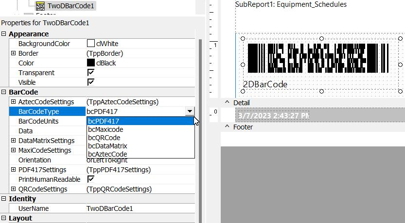
 2DBarCode
Renders 2D BarCodes. The string value assigned to the Data property is encoded based on the Bar-Codetype. The following symbologies are supported: PDF417, Maxicode. Note: The older DataMatrix Barcode and PDF417 Barcode objects from version 8.0 have been deprecated. If your reports contain these objects, you will receive an error when re-opening your project. Replacing your old object reference with the standard 2DBarCode component would be best.
Barcode Properties - BarCodeType
An additional way to print barcodes with even more barcodes than the standard 2DBarCode component referenced above. To get an overview of options, right-mouse click the object and choose "Settings...". Choose the "Main" option of the tree, and you will be presented with many different types of barcodes.
This object supports the following:
Linear barcodes: 2/5 Coop, 2/5 Datalogic, 2/5 IATA, 2/5 Industrial, 2/5 Interleaved, 2/5 Invert, 2/5 Matrix, ABC Codabar, AddOn 2 or 5, Codabar, Codabar Monarch, Code 39 Extended, Code 93 Extended, Code11, Code128, Code128A, Code128B, Code128C, Code39, Code93, Ean 13, Ean 8, Ean 99, Ean Velocity, EAN128, ISBN, ISMN, ISSN, ITF, JAN 8, JAN 13, MSI Plessey, OPC, PZN, Royal mail, SSC-14, SSCC, UPC E-0, UPC E-1, UPC Shipping, UPC-A, USPS Postnet 5
Stacked barcodes: PDF417, PDF417 Macro, PDF417 Micro, PDF417 Truncated
Postal barcodes: Australia Post Barcode, IntelligentMail Barcode, Telepen
Color Barcodes: Chromocode
2D - Matrix: DataMatrix, QR Code
 Rotatedlabel
Creates a Label that can be rotated. Text is set in the Edit toolbar. Right-click and select Angle... to choose how many degrees counter-clockwise to rotate the text.
 Simplegrid
Displays a grid. The number of rows and columns can be set by right-clicking on the grid and selecting ColCount... or RowCount...
 CheckBox
Displays a static checkbox. The styles available from the Edit toolbar are Checkmark and Box, X and Box, Checkmark only, or X only. Right-click to check or uncheck it.
 TeeChart
Displays standard (non-data-aware) TeeCharts. This component enables you to use TeeCharts inside the Report Designer. You can access the TeeChart editor via a popup menu.
Data Components Toolbar
These components are used to place objects that display data pulled from IndySoft. Use the Edit toolbar to select where the data is pulled from.
Data Components Toolbar
 DBText
Allows the addition of data text labels.
 DBMemo
Prints plain text from a memo field of a database table. This control will automatically word-wrap the text.
 DBRichText
Displays/prints formatted text from a data memo field. This control will automatically word-wrap the text.
 DBCalc
Used for simple database calculations (Sum, Min, Max, Count, and Average). The value can be reset when a group breaks using the ResetGroup property.
 DBImage
Prints bitmaps or Windows metafiles are stored in a database BLOB field.
 DBBarCode
Converts data from a dynamic data field to a Barcode symbol.
 2DDBBarCode
Renders 2D BarCodes based on the BarCodetype and the value supplied via the DataField property. The following symbologies are supported: PDF417, Maxicode.
 DBCheckBox
Displays a checkbox based on the field's value specified in the DataField property. This component can be used with a Boolean field (or any other type of field via the BooleanTrue (yes), BooleanFalse (no) properties).
 DBTeeChart
Allows data-aware TeeCharts to be placed within a report.
Productivity Tip
Remember to Right-Click in the component fields for more menu options.Advanced Components Toolbar
This toolbar will assist in creating advanced report components.
Adv. Comp. Toolbar
 Region
This creates an area in the band where other components can be placed. Any component in the region will move with the region—logically groups components. Use the ShiftRelativeTo property to move the region about another dynamically resizing component (such as Memo, RichText, or child-type Sub-Report).
 SubReport
This creates a new tab for entering specific data. SubReports give you the ability to organize dynamic amounts of data.
 PageBreak
Forces a new page during report generation. Placing a PageBreak on a report will cause all objects created after the PageBreak (Z-Order) to be moved to the next page.
 PaintBox
 CrossTab
Allows you to generate a set of calculations summarizing the data from a database table. It displays the calculations in a grid format.
 Google Map
Select the object and set the Address and Zoom property to use - these options can also be set for the object using Calc tab scripting.
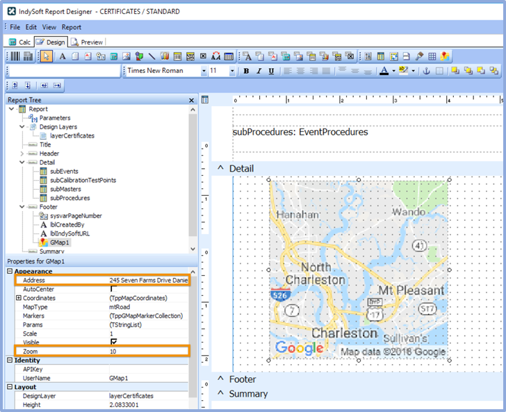
IndySoft Project Designer - Google Maps Integration
Standard Toolbar
This toolbar will assist with saving the report layout, accessing the print and print preview options, and accessing the cut-and-paste operations. To access this toolbar, select View...Toolbars...Standard menu option from the Report Designer main menu.
Standard Toolbar
 New Report
Creates a blank report layout.
 Open Report
Displays the Open dialog, allowing you to open an existing report layout.
 Save Report
Saves a report layout to a file.
 Page Setup
Displays the Page Setup dialog, allowing you to set the paper size and configure the layout for the report.
 Print
Print
Displays the Print dialog before sending the report to the printer.
 Print Preview
Displays the Print Preview window.
 Cut
Cut
Cuts the currently selected components into the clipboard.
 Copy
Copy
Copies the currently selected components into the clipboard.
 Paste
Paste
Pastes the components in the clipboard into the report.
Edit Toolbar
This toolbar will assist in setting the most important property or properties for the currently selected component.
- No component selected:
- Data-aware component selected:
This configuration allows the data pipeline and data field for the component to be set. The drop-down list on the left shows the data pipeline. The drop-down list on the right shows the field name.
- Data/Label component selected:
Finally, this configuration shows the data, label, shape, line, and check box information.
Format Toolbar
This toolbar contains standard word-processing functions. It will also assist with layering the components.
Format Toolbar
Font Name
Selects the font name for textual components. Use TrueType fonts (indicated by a  icon) when possible. These render well on both the screen and printer.
Font Size
Selects the font size. You can also type in this box to set the font size exactly.
 Bold
Bold
Sets the font to bold.
 Italic
Sets the font to italic.
 Underline
Sets font to underline.
 Left Justify
Left justifies the text in the component.
 Center
Centers the text in the component.
 Right Justify
Right justifies the text in the component.
 Font Color
Sets the font color.
 Highlight Color
Sets the background color of the textual component.
 Anchors
Specifies how a report component is anchored to its parent. Use Anchors to ensure that a report element maintains its current position relative to an edge of its parent control (i.e., Band/Region), even if the parent is resized.
 Borders
Specifies which of the outside border lines of a report component are rendered.
 Bring to Front
Brings the component to the front. The components in the front print last, and those in the back print first. Use the Report Tree to see the exact layering of components within the band.
 Send to Back
Sends the component to the back. The components in the front print last, and those in the back print first. Use the Report Tree to see the exact layering of components within the band.
Align or Space Toolbar
This toolbar will assist in positioning components relative to one another and relative to the band in which they appear so they are organized uniformly. To access this toolbar, select View...Toolbars...Align or Space menu option from the Report Designer main menu.
Align or Space Toolbar
 Align Left Edges
Align a group of components with the leftmost position of the selected component.
 Align Middle
Centers are a group of components based on the horizontal center of the component that was first selected.
 Align Right Edges
Align a group of components with the rightmost position of the selected component.
 Align Top Edges
Aligns a group of components with the topmost position of the component that was selected first.
 Align Center
Aligns a group of components based on the vertical center of the component that was first selected.
 Align Bottom Edges
Aligns a group of components with the bottommost position of the component that was selected first.
 Space Horizontally
Spaces a set of components based on the leftmost position of the first component selected and the rightmost position of the last component selected.
 Space Vertically
Spaces a set of components based on the topmost position of the first component selected and the bottommost position of the last component selected.
 Center Horizontally in Band
Centers a component horizontally within a band.
 Center Vertically in Band
Centers a component vertically within a band
Productivity Tip
Remember to Right-Click in the component fields for more menu options.Size Toolbar
To access this toolbar, select View...Toolbars...Size menu option from the Report Designer main menu.
Size Toolbar
 Shrink Width
Determines the minimum width of all the selected components and then sets the width of the components to that value.
 Grow Width
Determines the maximum width of all the selected components and then sets the width of the components to that value.
 Shrink Height
Determines the minimum height of all the selected components and then sets the height of the components to that value.
 Grow Height
Determines the maximum height of all the selected components and then sets the height of the components to that value.
Nudge Toolbar
To access this toolbar, select View...Toolbars...Size menu option from the Report Designer main menu.
Nudge Toolbar
 Nudge Up
Moves all selected components one pixel up.
 Nudge Down
Moves all selected components one pixel down.
 Nudge Left
Moves all selected components to one pixel to the left.
 Nudge Right
Moves all selected components to one pixel to the right.
Productivity Tip
To adjust multiple components at once, click in the white space area outside the component and drag the cursor to select multiple components. Or hold the 'CTL' key as you click each component individually to form a group.Productivity Tip
Use the keyboard to move and align components. Select a component, then CTL + 'arrows' for minor adjustments. CTL + Shift + 'arrows' for larger adjustments.Draw Toolbar
This toolbar will assist in setting the colors and borders of components. To access this toolbar, select View...Toolbars...Draw a menu option from the Report Designer main menu.
Draw Toolbar
Fill Color
For shapes, lines, and region components only. Sets the Brush—color property. To set the color of a textual component, check the Highlight Color action of the Format toolbar.
Line Color
For shapes, lines, and region components only. Sets the Pen—color property.
Line Thickness
For use with a Line component only. Sets the Weight property.
Line Style
For use with a Line component only. Sets the Pen.Style property.
Trees
Along with the toolbars, two trees allow you to navigate the available resources quickly. The trees are dockable and follow the Office interface style. The trees are accessible from the View...Toolbars menu option of the Report Designer or by right-clicking on the docking area at the top of the Report Designer.
The Report Tree
The Report Tree gives you an overview of how the components of the report are organized and the ability to select any item in the report to find it. Click on an object in the Object Outline, and the corresponding object will be selected in the band it is located in.
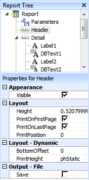
Report Tree
The Data Tree
The Data Tree's Data tab allows you to drag-and-drop Fields onto a band and have either or both an appropriate Label and the Data field appear. This can make it easier to place the desired data in your report. You can shift-click or ctrl-click to select multiple fields at a time.

Data Tree - Data Tab
The Data Tree's Layout tab controls how data will be displayed when you drag-drop it into a band. It can place Labels, Fields, or both, with items placed in a Vertical or Tabular Style. Vertical puts labels next to data. Tabular puts labels above data.

Data Tree - Layout Tab |